
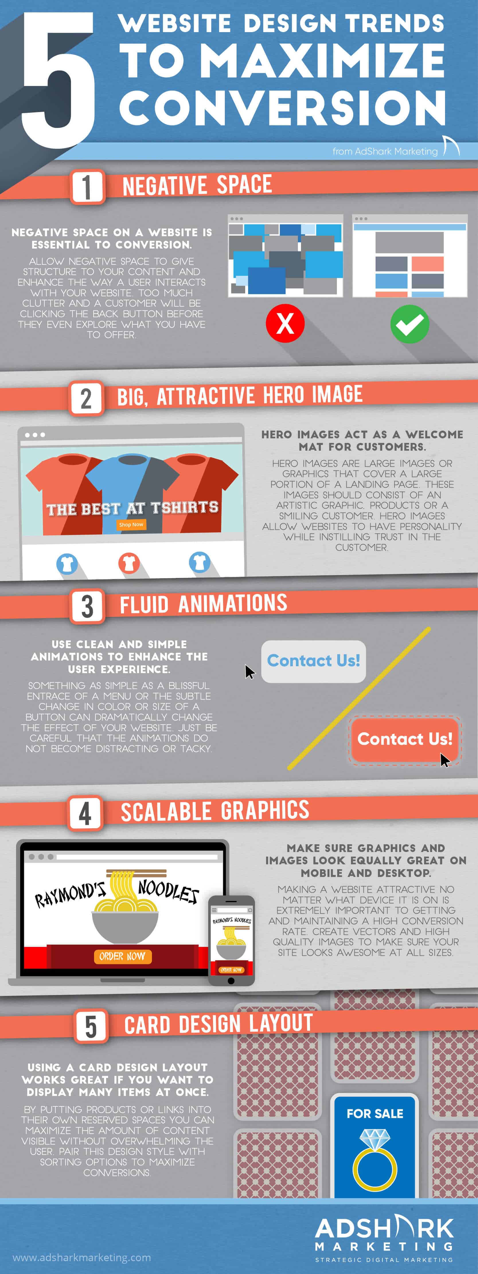
5 Website Design Trends to Maximize Conversion
A well designed and easy to use website is critical if you are seeking to create conversions with your customers. Many times designers are faced with the challenge of creating a website that both looks incredible and makes the conversion process simple. Because this is by no means a simple thing to do, we’ve looked into five current trends in website design that can greatly increase your company’s conversion rate if done correctly.
Below is an infographic with those five design topics shown followed by a brief description of each topic at the end.
5 Website Design Trends to Maximize Conversion Infographic
1. Negative space
We have all at one point or another visited a website that is so cluttered and busy that we simply cannot bare to look at it for more than a few painful seconds. The human eye naturally rejects these messy layouts and begs for relief by clicking the back button. That is why negative space in a website is essential. Great content is only made better when given its own space to live in. By harnessing plenty of negative space, a website can better showcase the things that really matter and give the user a more straightforward path to follow.
One thing to keep in mind when considering a website design is that negative space does not necessarily mean just a white space on your screen. Designers can fill negative space with an image or graphics to add aesthetics to the site. The key is to allow that space to give structure and enhance the way a user interacts with the content in the positive space.
2. Big, attractive hero image
A massive number of websites today feature a large image that covers the page and welcomes the visitor. This is called a Hero Image and the reason designers are using them so frequently is because they work. Whether that image is an artistic graphic, a product on display or a smiling customer, a hero image instills trust in customers and acts as a welcoming mat for a website. The hero image allows a designer to create a robust and stunning homepage without having to load up on intimidating text and menu options. Instead, a few menu options or product displays will allow the visitor to choose where they want to go in a website instead of scaring them away before they explore anything.
Keep in mind that a hero image does not need to cover the entirety of your homepage. Many websites will use the image as a banner towards the top of their page which will cover anywhere from half to ¼ of the screen. Depending on the purpose of your website, try experimenting with size and type of image to see what works best. As I mentioned above, artistic graphics, high-quality product images, and smiling faces tend to work the best as hero images.
3. Fluid animations
By fluid animations, we do not mean tons of distracting gifs or special effects plastered all over your website. We are talking about clean movement animations used in menus, links, and navigation. This can be as simple as a menu blissfully expanding to showcase the items a company offers. This can be a loading bar used to help a customer anticipate the next part of a site. Even something as simple as a button changing color or growing slightly larger when you hover over it can make your website seem immensely more interactive and attractive. Instead of having a solid, static experience, add animations to your website’s navigations and graphics to bring it alive and make it more enticing.
4. Scalable graphics
It has become common knowledge in the marketing world that mobile website design is just as important as desktop design. Making sure a user can get the most out of your website regardless of their chosen device is extremely important if you are looking to convert customers. In order to make sure your website is just as attractive and useful on mobile as it is on desktop, make sure the graphics and images on your site are scalable to any size. This can be done by creating vector images or graphics that can be scaled to any size and saved to match the device it will be shown on. If you use a jpeg, make sure that the quality is high enough to look great at large sizes but also keep the file size as small as possible to ensure your site is fast and reactive.
5. Card design layout
Websites like Pinterest and Craigslist have been using this type of layout on their websites for years and for good reason. By putting products or links onto their own cards, it allows a user to easily decide whether it is something that interests them or whether they should skip to the next thing. The card design layout provides a sense of endless options in a way that doesn’t overwhelm the viewer. Because everything is contained in a square shape you can really maximize the amount of content visible on your site. Pair this design style with a sorting function on your website and you are sure to see your conversation rate skyrocket. The card design layout tends to work especially well on mobile devices where screen real estate is limited.
In conclusion
Do you have any questions about web design or want to work with us, get in contact with us today.
Ready To Grow?
Let's Talk!
