")
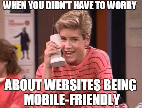
10 Design Tips For Creating A Mobile-Friendly Website
Fads come and go. In 2002 you were probably using a Sidekick and friending Tom on Myspace. But today, millions of people literally have the internet in the palm of their hand. If you’re an e-commerce business and still stuck in the past, it’s time to wake up.
53% of website visits came from mobile devices in 2019. Google also announced it was rolling out mobile-first indexing in 2018. Designing a mobile-friendly web site is not only important from a user experience standpoint but also an SEO standpoint.
If your website is not mobile-friendly, it’s time to update it. A web design agency can help you determine what platform and type of mobile-friendly design you should use. Here we’ve comprised a list of tips to keep in mind when designing your mobile-friendly site.
Designing a Mobile-Friendly Website
Go Responsive
A responsive website uses a framework that lays out elements in a grid and then resizes that grid based on the screen being used. Responsive sites allow you to create an omnichannel experience no matter what device you are using and provides an SEO benefit. It’s also easier to manage on a daily basis.
Size Matters
Zooming, clicking something too small or not being able to project an image is a frustrating user experience. Choosing the right size for buttons, images, and fonts are important in mobile design. We recommend no smaller than 14px font. For buttons, Apple recommends button sizes be at least 44px x 44px. Having the right size button can increase conversions on your mobile site.
Keep It Simple (and Clean)
Simplifying your design for mobile will help improve the user experience. Audit your site to remove unnecessary content. Also, too many graphics or videos will slow a site down.
Don’t use Pop-Ups
Pop-ups and mobile browsers are like oil and water, they don’t mix. Plus, they are annoying for the user. Avoid them when designing your site to eliminate user frustrations and increase conversions.
Break Up Long Content
Tell your story in as few words as possible. Having too much text clutters a site. Also, break it up into smaller sections to target scanner readers. H2, bulleted lists and small paragraphs are easier to read than long paragraphs.
Optimize Images for a Mobile-friendly Website
Bandwidth on mobile is a lot less than a desktop, which causes longer loading times. Be sure to keep your images as small as possible while maintaining clarity. Keeping image files small will help load times and reduce user experience frustration.
Calls To Action
Do your users perform regular tasks on your site? Keep that call-to-action on the homepage, above the fold. Put secondary calls-to-action in the menu or below the fold.
Access to Home Page
Linking your logo in the upper left corner to the home page is standard practice. If a user tries to click on it and it doesn’t work or doesn’t go to the home page, they get frustrated. Having easy access to your home page is essential for your mobile site usability.
Don’t Hide the Search
Google has trained us to use the search bar. A user who is looking for a specific product or information will automatically look for it, so don’t hide it in the menu. Also make sure you use autocomplete queries, correct misspellings and suggest related queries.
Guest Checkout
A complicated checkout process is one of the leading causes of abandoned carts. Not only should your checkout process be smooth on your desktop, but you also want to ensure an easy, simple process on your mobile site. Ecommerce customers can get frustrated by having to create an account when making a purchase. Allowing guest checkout provides an easy and convenient way for users to make purchases on your site.
How Can AdShark Marketing Help With A Mobile-Friendly Website?
Need help updating your website to include mobile-friendly design? Our team of web designers and developers can help. We have the expertise to build a website and manage your digital marketing needs.
Ready To Grow?
Let's Talk!
