
The Beginner’s Guide to Designing Impressive Display Ads
Display advertising plays a major role in the world of digital marketing. Through Google alone, there are more than 2 million websites that participate in displaying ads to potential customers. Depending on your advertising goals, using display ads could prove to be extremely beneficial to your campaign’s success. But just like with any form of advertising, there are certain aspects that work great and some that could completely ruin the purpose of your campaign. One of the most important aspects to focus on in Display Advertising is how you choose to design your ad. This blog will be a beginner’s guide to what actually works and what you can do to have the best looking and highest converting display ads across the internet.
The big three in display ad design
There are three basic and essential components to designing an impressive display ad which we will look at first. They include your company’s logo, your company’s USP (Unique Selling Proposition) and a call-to-action. If any of these three components are missing in your ad, the chances of having a successful campaign are greatly diminished.
1. Ask what your logo can do for you!
For nearly every company out there, the heart of their brand is contained in the company logo. It is usually the logo that gives a brand or business the ability to be recognizable and trusted. Whether you are a new company trying to develop brand recognition or an established business attempting to maintain a customer’s loyalty, your logo will be at the forefront of customer relations. That is why it is critical to make your logo stand out when designing display ads.
A logo can serve multiple purposes in an ad. Other than building brand identity, a logo can be the best vehicle for showing customers what your company has to offer. If your logo clearly represents what the business can provide for a customer, this can remove the need to include text and images that could clutter your ad. Take Pounds Restaurant in Fargo, ND (@POUNDSfargo) as an example. By incorporating an image in their logo, it is made clear that they are a restaurant whose primary focus is on burgers. This eliminates the need to include extra images or words that reiterate that they make delicious burgers.

Pound’s logo makes it clear that they are a restaurant that serves burgers.
2. Focus on your USP
USP stands for Unique Selling Proposition. This is what makes your business stand out from the rest. Whether that be a unique product feature, better prices, excellent customer service or anything else, make it clear to your customers why they should pursue choosing you in your display ads.
The USP can be made obvious to a viewer in many ways. Sometimes this is done by directly stating what sets your company apart from others. Other times it is done in a much more discreet way. Something as simple as a color choice (which we will look at later) can be all it takes to get your point across.

USP directly stated

USP implied by imagery
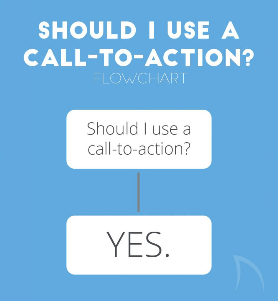
3. A call-to-action is a must
If you are asking yourself if a call-to-action (CTA) is necessary, the answer is yes. And it should always be yes. The purpose of advertising is to convince someone to do something. A call-to-action makes your objective clear and easily understood. Without a CTA it is up to your viewer to decide what they should do to get more from your company. By creating a call-to-action button or clearly stating what you want them to do, it makes the conversion process dramatically more straightforward for a potential customer.
The website createdebate.com saw a 45% increase in link clicks by creating an impelling CTA action button. (source: CopyBlogger)
Visual design concepts to pay close attention to
1. Consider your color choices
Color is one of the most critical and difficult aspects of display ad design. When choosing what colors to use in an ad, consider things like which websites your ads will be placed on and what colors will complement your company’s brand. Every designer wants their ad to stand out and attract the gaze of viewers. If your company’s brand colors do not compel customers to look at your ad, try using other appropriate yet catchy colors.
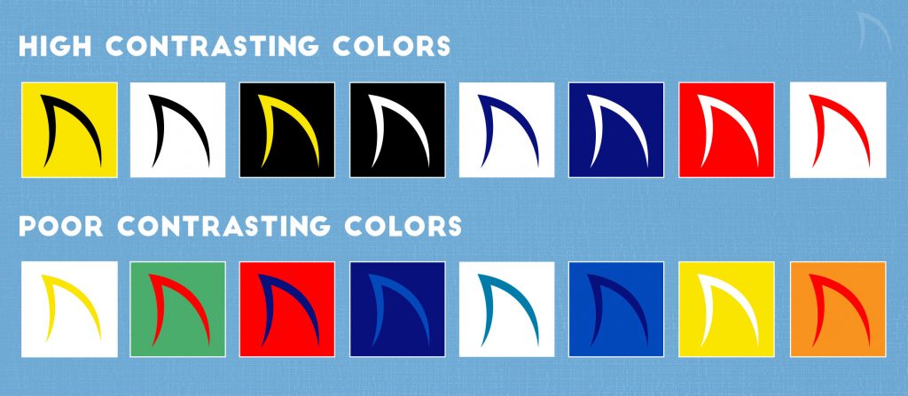
When it comes to picking a color for your CTA button, it is best to pick a dominant color that creates contrast with the main color of your display ad. Refer to the guide below for some examples of contrasting colors.
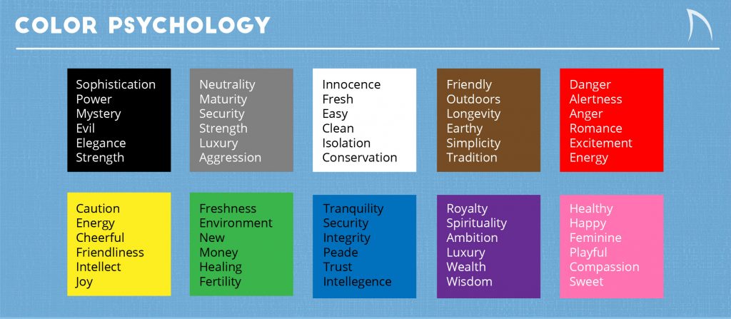
Colors play a major role in the emotional feel of an ad as well. If you want to make your display ad strike certain feeling within a customer, it best to use a color that will help emphasize that emotion. Below is a chart that shows which colors link with which emotions.
To really be efficient with expert color usage in design, it is best to have some background knowledge in color theory. Check out this blog article, Color Theory Basics, from LifeHacker.com that touches on all of the key aspects of color theory. Also, check out one of my favorite tools to use for developing color palettes at www.paletton.com
2. Font design is critical
A beautiful font can completely change the feeling and overall quality of an ad. It is important to keep in mind that usually the more simple the font, the more likely it will look great on an ad. Refer to the company’s website and logo to see what font styles they are already using to represent their brand. Stay away from using gimmicky or over-stylized fonts that could be distracting or appear tacky. BoredPanda compiled a hilarious list of 11 fonts that designers love to hate that includes fonts you should stay away from in designing display ads.
One of my favorite trends in typography right now is the use of contrasting thick and thin fonts. By using a font that has both a bold and a thin weight, you can create a visually appealing message by creating an odd balance with the two settings. A great font for creating this effect is Big John and Slim Joe by Ion Lucin which can be seen and downloaded on his Behance page.

Example of contrasting font thicknesses.
3. Use negative space
Because display ads often have little space to work with, designers tend to want to cram as much stuff into that limited space as possible. The result is a cluttered and overwhelming ad that no one wants to look at. It is important to leave enough negative space in an ad to allow the important content to breathe and be noticed. For those who do not know what negative space (or white space) is, it is the areas of a design that do not require a viewer’s attention and instead provide space for important content to live in.

Very little negative space

Great usage of negative space
4. Be minimal
The human brain has been trained to avoid paying attention to things that are visually complicated. Instead, a viewer’s eyes tend to seek out designs that are simplistic and easy to look at. This is very important to remember when laying out your display ads. Use the tips offered above to keep your designs simple and free of unnecessary content.
5. If you use images, let them do the talking
Because display ads are relatively small, using images in display ads commonly does not work. If your ads are large enough to feature images, then use them to your advantage. The old adage “a picture is worth 1000 words” is most true in display advertising. Choose pictures that deliver the messages you are trying to relay so you can remove text and make room for more useful content.
Be very selective when choosing images for display ads. It is best, if possible, to use original images instead of stock photos or random photos are seen on the internet. By using original images you can avoid running into copyright issues and you can avoid the tacky quality that is generally associated with stock photos. Keep in mind that images do not always work with display ads. It never hurts to design multiple versions of an ad, with or without images, and see how each one does.

Even if you don’t speak Spanish, the image still gives important information.
Two things to keep in mind while designing
1. Stay focused on your brand
Customers who decide to click your ad or look into what you have to offer expect to be brought to a website that has the same feel as your ad. Often times when a display ad has a completely different design than the website that it brings them to, the customer will lose trust and leave before even exploring what you have to offer. Along with helping develop trust with potential customers, keeping your display ads branded will help with developing brand identity.
2. One size does NOT fit all
Do not be afraid to test out multiple sizes of display ads to find out which ones connect best with customers. Not all sizes will work out and some will definitely perform better than others. If the display ads you are designing are all for the same campaign, you can make the ads look very similar. Using the same colors, fonts, graphics, and call-to-action buttons are acceptable as long as it is arranged to look best at whatever size you are using.
Make sure to become familiar with the different specifications that are needed on the specific networks you are planning to advertise one. Google, Yahoo and Bing are the most popular networks and all have slightly different specifications for display ads. Those specifications can be found at the links listed below:
Google | Image Size Specifications
Bing | Product Ads and media formats
In conclusion
Developing and designing display ads is not always an easy task. Creating ads that will attract viewers and convince them to become customers is a skill that takes practice and time to perfect.
Remember to always use The Big Three when designing. The company logo, a unique selling proposition, and a clear call-to-action are the foundation of any display ad. Really focus on finding what colors will work best for your ad and which fonts will best represent it across the web. Keep designs simple and minimal by letting pictures do the talking when necessary and really harness the power of negative space. And finally, make your display ads an extension of your company’s brand while testing which styles and sizes will work best for the greatest results. By following the suggestions above, you will be well on your way to designing professional and high-quality display ads.