5 Mistakes to Avoid When Designing Digital Ads
This morning, I logged into Instagram and started scrolling. Within 3 minutes, I had been served a whopping total of 15 ads; everything from outdoor-themed t-shirt brands to online learning services. And my experience is not unique.
According to Zippia, the average American is exposed to over 4,000 ads per day. Between banner ads on websites, over-the-top ads on Hulu, and social media ads – there is seemingly endless inventory for businesses to reach their audience. But many businesses fail to prioritize the most important piece: designing impactful ads.
Whether you’re running video ads, static/image ads, or text-based ads, it’s important that you take the time to understand your audience and develop ad content that sticks. Is your team doing so effectively?
We’ve been designing digital ads for over 10 years as an agency. In those years, we’ve learned what to do, and (even more importantly) what not to do. And today, we’ll be sharing that with you.
Let’s dive in to review the 5 mistakes to avoid when developing your digital ads!
#1 – Stuffing Too Many Messages Into a Single Ad

We find that the best ads do a great job of communicating one effective message. It’s common to want to relay all of your selling points to a potential customer, but by stuffing too many messages into a single ad, it makes it more difficult for viewers to retain any of them. If you have several value propositions to get across, consider testing them in different ads. Compare results to see which messages resonated the most with your audience.
AdShark Tip: When developing your ad creative, focus on building a concept that can effectively communicate one, single key message to your audience.
#2 – Failing to Provide a Clear CTA

A CTA is one of the most essential elements of a digital ad, regardless of medium. This is what prompts the viewer to take action, such as clicking a link or making a purchase. A weak or unclear CTA will oftentimes lead to low engagement- and click-through-rates, both of which can be detrimental to your campaign’s success. Make sure your CTA is prominently displayed on the ad creative itself (i.e. inside the design or video) or in the complementary text.
AdShark Tip: For prospecting audiences (first-time engagers of your brand), couple your CTA with an offer. For example, “Contact today and receive a FREE 15-minute consultation.”
#3 – Using Too Much Text on Ad Imagery

We’ve had customers ask to use the PDF of a job description in their Facebook Ad. It was a bit much. The rule of thumb historically has been to ensure that your ad is a maximum of 20% text, and 80% imagery. Though Meta will allow you to have more than 20% of your ad be text-based now, still try to resist the temptation. Have photo, video, or design content that effectively stops the scroll, and focus on minimal (but impactful) ad copy to complement it.
AdShark Tip: Even when running video ads, don’t feel the need to use large subtitles to capture every word from the video. Instead, highlight one sentence or phrase at a time that is impactful.
#4 – Using Imagery or Video That Doesn’t Explain the Product or Service on its Own

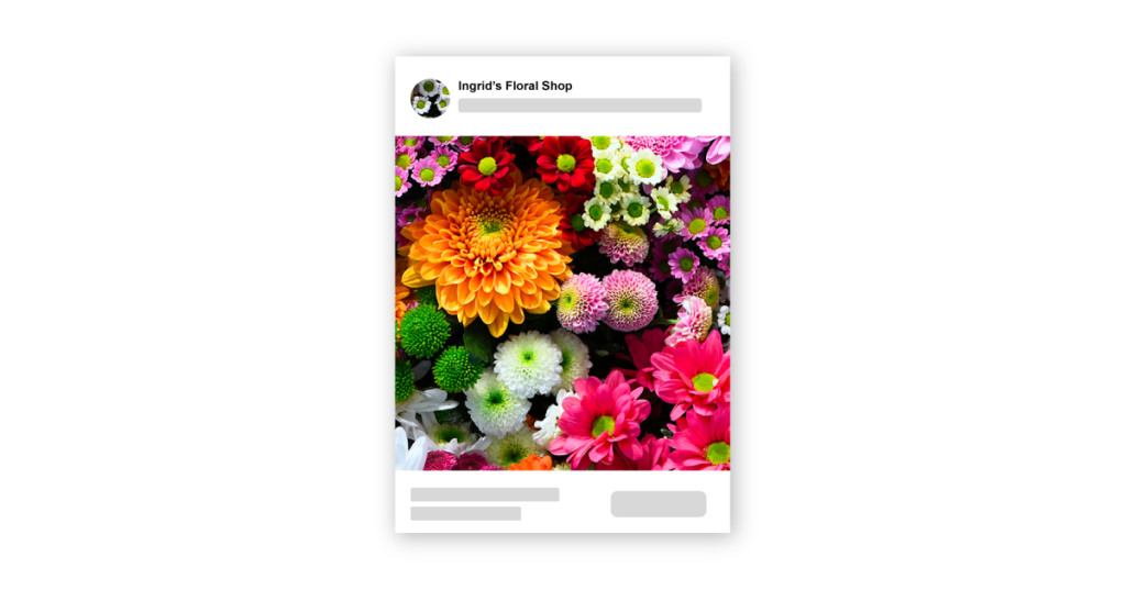
A test that we run internally is hiding the top copy and header/descriptions on an ad, in addition to any text that may be on the graphic or video. Then we ask ourselves, do I know what product or service is being sold? Though you may be familiar with what your brand offers, first-time ad viewers are likely not. Thus, it’s important to help them out by using photos, videos, and design elements that can effectively get across what you sell, regardless of whether they read the accompanying text or not.
AdShark Tip: Avoid taking a while to get to the point. If you’re running a video ad, don’t start with a scene of someone talking to the camera (unless they have the product in hand). If it takes you more than a couple of seconds to show what it is you’re advertising, you will likely have lost your audience.
#5 – Not Designing for The Placement

A test that we run internally is hiding the top copy and header/descriptions on an ad, in addition to any text that may be on the graphic or video. Then we ask ourselves, do I know what product or service is being sold? Though you may be familiar with what your brand offers, first-time ad viewers are likely not. Thus, it’s important to help them out by using photos, videos, and design elements that can effectively get across what you sell, regardless of whether they read the accompanying text or not.
AdShark Tip: Avoid taking a while to get to the point. If you’re running a video ad, don’t start with a scene of someone talking to the camera (unless they have the product in hand). If it takes you more than a couple of seconds to show what it is you’re advertising, you will likely have lost your audience.
Unsure where to turn for your next digital ad designs? Whether it’s video ads, animated ads, or static ads – feel free to contact our team. We’d be happy to talk to you about additional tricks we’ve learned, or help work on your next ad design. Good luck with your next digital design project, and we hope you found this blog to be beneficial! Keep tuning in for more additional digital marketing topics to come.
Ready To Grow?
Let's Talk!

