
10 Web Design Inspirations for Chiropractic Clinics in 2023
“I need your sweet, sweet inspiration” is a lyric Diana Ross wrote in 1968. It’s also a mantra I recite in my head anytime I look for website designs for a new client.
A few weeks ago, we published a blog about the 23 steps you need to consider when launching a new website. Step 3 involved creating an inspiration list of website examples that will help you get started.
Building an inspiration list of websites is helpful in many ways, including:
- Helping to jumpstart your creativity
- Identifying design characteristics you’d like to emulate in your website
- Developing content and page ideas
- Providing guidance for your web designer or web design agency
If you oversee the marketing efforts for a chiropractic clinic, this blog is for you. We scoured the internet to find 10 of our favorite chiropractor websites and are excited to share that list with you. We hope these 10 chiropractic web designs inspire you and can help launch your new web design process.
Let’s dive in!
#1 – Mountain View Pain Center (Denver, CO)
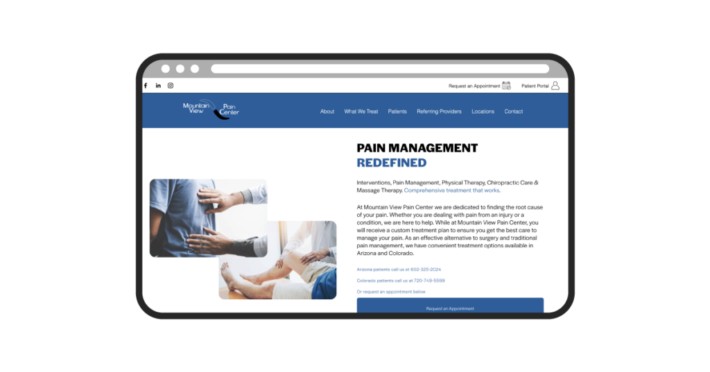
The first web design inspiration comes from Mountain View Pain Center in Denver, CO. Though some stock photography appears to be used on the home page, it is clear that the web team for this site focused a lot on the written content and site navigation. The calls-to-action are clearly identifiable & user experience is solid all the way through.
Link to Website
https://mountainviewpaincenter.com/
Web Platform Used
It appears to have been built on WordPress, using a theme called Medicare Theme.
5 Website Features We Liked Most
- Clear conversion points (phone/call & appointment requests)
- Iconography to highlight different services offered
- Inclusion of Patient Testimonials on the home page
- Map to show various locations
- Blog to help incorporate routine content
#2 – UTC Chiropractic (San Diego, CA)
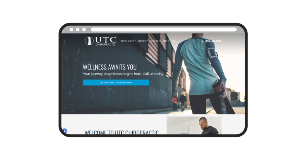
The second chiropractic website that inspired us was UTC Chiropractic’s. This chiropractic business, located in San Diego, CA, immediately caught our attention with an eye-catching image in the hero banner. We also appreciated how concise their navigation menu was, and their transparent offer on the home page ($29 adjustment + free exam & xrays). Dr. Caldwell and his team did a great job of providing information that first-time visitors would find to be helpful.
Link to Website:
https://www.yourchiropractorsandiego.com/
Web Platform Used:
It appears to have been built using a ChiroMatrix content management system.
5 Website Features We Liked Most:
- Inclusion of an offer ($29 adjustment + free exam) in the hero banner
- Helpful resources (such as intake form) in the Patient Center tab
- Service pages that appear to have been made with SEO in mind
- The “where is your pain” graph on the home page, linking to service pages
- Use of embedded video for testimonials & exercises – good content to have
#3 – Brooklyn Chiropractic Studio (New York City, NY)
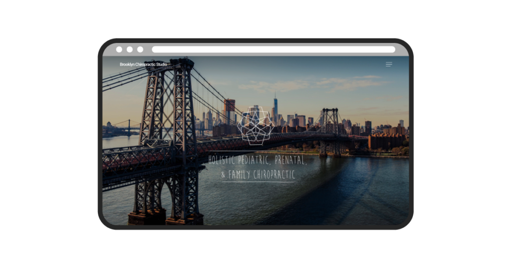
Fans of minimal design will love this website. An inviting logo and typeface on the hero banner, a collapsible menu, and clearly personalized home page content makes for a great introduction to this brand. Though you have to scroll down a ways to find any imagery related to the chiropractic work they do, the content is presented well enough to encourage you to continue to scroll.
Link to Website:
https://brooklynchiropracticstudio.com/
Web Platform Used:
It appears to have been built on WordPress using a Jane App content management system.
5 Website Features We Liked Most:
- Great hero image, localized to the audience they serve
- Introductions to the chiropractors/team
- Clean appointment request CTA (although, would prefer it to be above the fold)
- Inclusion of scrollable reviews
- Design of the footer, including the map
#4 – Corrective Chiropractic (Atlanta, GA)
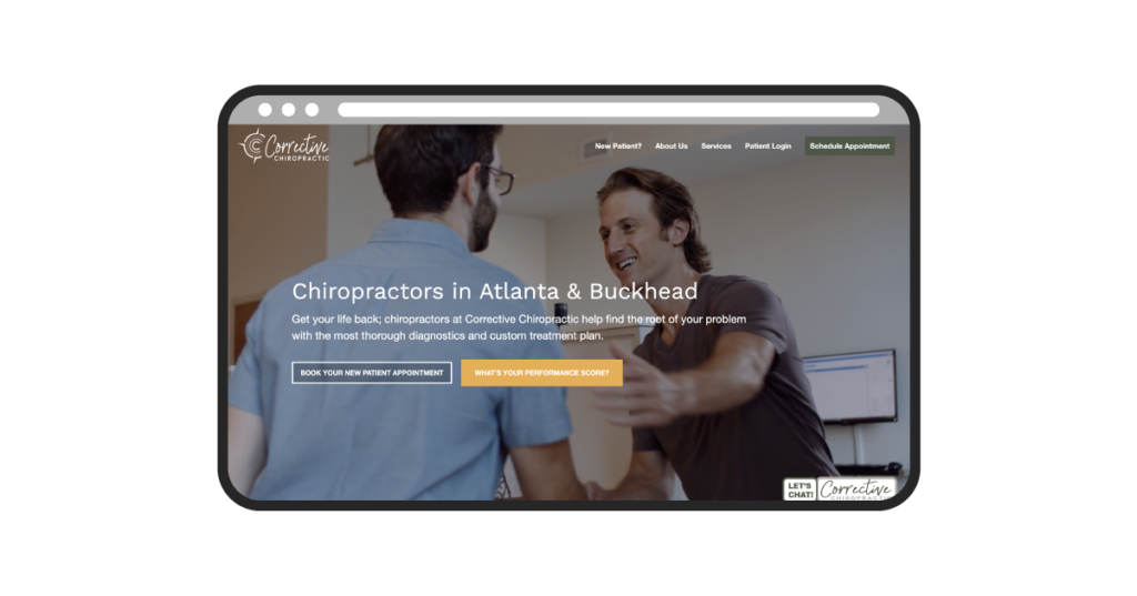
If we lived in Atlanta, we’d be rushing over to Corrective Chiropractic after reviewing their website. When you first visit the Corrective website, you’re greeted with a video that shows their staff’s interaction with several different clientele. You also receive a pop-up offer for their Live Well Box, which guides you towards an eCommerce page they’ve created. The marketers behind this site were very thoughtful with their approach.
Link to Website:
https://www.correctivechiropractic.com/atlanta/
Web Platform Used:
It appears to have been built on WordPress.
5 Website Features We Liked Most:
- Video content in the hero banner
- Live chat & schedule appointment functionality – good conversion points
- The inclusion of a “new patient special” to drive first-time customers
- A video message from the Founder & additional chiropractors on the home page
- eCommerce functionality with the “Live Well Box”
#5 – Airrosti (San Antonio, TX)
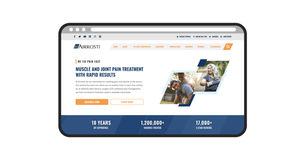
Airrosti is a healthcare group that provides rapid recovery treatment for soft tissue injuries. With over 18 years of experience, they’ve had some time to polish their brand and reflect said brand on their website. Though they are based in San Antonio, they have locations across the country and also offer “virtual clinic access,” as noted on their homepage.
Link to Website:
Web Platform Used:
It appears to have been built on WordPress, using WPBakery.
5 Website Features We Liked Most:
- Patient portal and online bill pay access
- Strong CTA to “schedule now” on the hero banner
- Authority-building through the inclusion of Trusted Partners
- A compelling offer with a “no cost assessment” over video
- Linking to social media platforms to stay connected
#6 – McKinley Family Chiropractic (Chicago, IL)
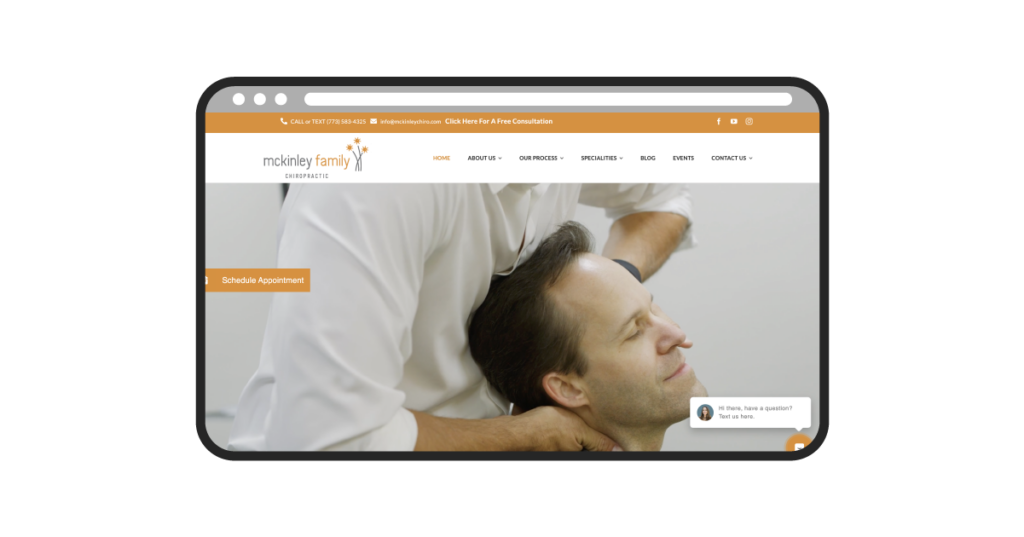
If you’re in the Chicago area, you may have already heard of McKinley Family Chiropractic. But have you taken the time to appreciate their website? For a chiropractor that is focused on athletes, family care, kids, and expectant mothers, their website does a great job of aligning with their audience. A warm hero banner video introduces their work, while solid page content helps to share more of their story. This is a great chiropractic website example to follow.
Link to Website:
Web Platform Used:
It appears to have been built on WordPress, using Avada as their content framework.
5 Website Features We Liked Most:
- Schedule Appointment and Live Chat CTAs that follow you as you scroll
- Solid brand introduction video used in the background of their hero banner
- Strong supporting page content such as “Events” and “Our Process” to help highlight more about their company
- Free consultation offer in the banner at the top of their website
- Solid footer design w/ text OR call options
#7 – Kansas City Chiropractic (Kansas City, MO)
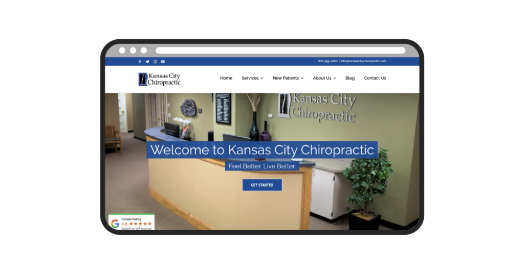
Though this website design may not blow you away with flashy details or visuals, we’re drawn to the simple layout and strong user navigation provided by this website. For locals in Kansas City, I also like how the home page banner doesn’t rely on stock imagery or aspirational photos, but shows a preview of the calm, relaxed environment of their office. As a first time visitor, seeing what the clinic looks like may provide an even greater chance of them converting/contacting you.
Link to Website:
https://kansascitychiropractic.com/
Web Platform Used:
This site also appears to have been built on WordPress, using Avada as their content framework.
5 Website Features We Liked Most:
- Personalized photography used for the homepage hero banner and the meet the doctors section
- Patient testimonials highlighted on the homepage & Google ratings/reviews shared throughout the website
- Page resources and content related to new patients
- Links to social media pages to learn more
- An “Office Tour” to provide you an even greater look at what the experience at Kansas City Chiropractic will look like
#8 – Pain Free Chiropractic (Philadelphia, PA)
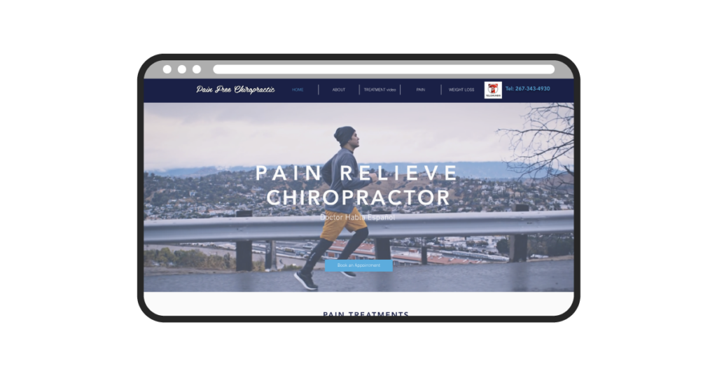
In West Philadelphia, born and raised. At the chiro’ is where I’d spend most of my days. There were enough positives on this website to help outweigh the slight typo of “pain relieve* (instead of relief) chiropractor” on the hero banner. This website is easy to navigate, provides you quick information on the treatments offered, and has a solid appointment request form that serves as a conversion point.
Link to Website:
https://www.phillypainfreechiropractic.com/
Web Platform Used:
This site appears to have been built on Wix.
5 Website Features We Liked Most:
- Hero banner video that is engaging and catches your attention
- Strong CTA (Book an appointment) on the hero banner
- Inclusion of accepted insurance on the home page
- Footer information on the clinic and contact form
- Noticeable consideration towards SEO in title tags and headers throughout the website
- Treatment page content that calls out pricing information & what each visit may include
#9 – Backfire Chiropractic & Massage (Seattle, WA)
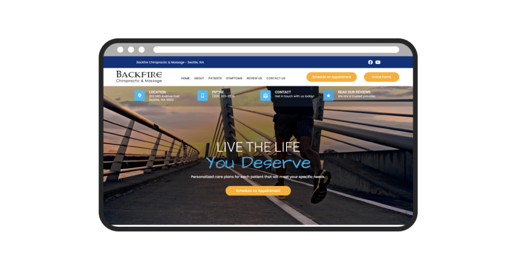
Two straight examples with video footage of a runner in the hero banner? Maybe we’re getting too predictable. As digital marketers, we can’t help but be drawn to websites that have strong conversion points. Right as you land on this page, you’re greeted with 3 key conversion spots – a phone number to call, a contact form to fill out, or a spot to schedule an appointment. The only part of this site we don’t love is a Maya Angelou quote underneath the Testimonials section (who knows, maybe she was a client).
Link to Website:
https://www.backfirechiropractic.com/
Web Platform Used:
This site appears to have been built on WordPress, using the Inception Chiro content management system.
5 Website Features We Liked Most:
- Great use of conversion points throughout the website
- Strong navigation and user flow on the home page
- Pages dedicated to the various symptoms that Backfire treats
- Use of a new patient special (offer) to entice more conversions
- Easy access to online forms and paperwork
#10 – Berry Hill Chiropractic (Nashville, TN)
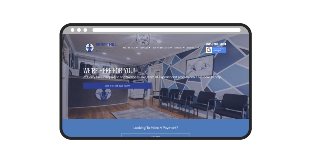
Berry Hill Chiropractic is a chiropractic & wellness company based in Nashville that has shades of blue in their brand colors. If you head over to their website, it’s pretty clear through their very blue home page. We love how this website helps to highlight the Berry Hill brand and how it provides a solid foundation on the team that makes up Berry Hill Chiropractic. It was built on the same web platform as our #2 example (UTC Chiropractic), and several of the items we liked most are similar.
Link to Website:
https://www.berryhillchiropractic.com/
Web Platform Used:
This site appears to have been built on the ChiroMatrix content management system.
5 Website Features We Liked Most:
- Strong conversion points throughout the website
- Good page content related to the symptoms that Berry Hill treats
- Great homepage/hero photo that shows potential first-time visitors what the Berry Hill office looks and feels like
- Resources on the New Patient Center
- Team photos and content about the staff at Berry Hill
Common Trends of Our Favorite Chiropractic Clinic Websites
As we explore these 10 websites above, there are some common themes that we can identify which make for a strong web design. Those include:
- Personalizing the content to their practice (less stock photos and generic text)
- Strong conversion points (phone calls, form fills, etc.) throughout the website
- Service pages and general page content that takes SEO into consideration
- Content that is designed to acquire first-time visitors / new patients
- Footer designs that provide solid information on how to contact their practice & where they are located
- Hero designs that use imagery or video that catches the eye
- The use of testimonials and reviews to help build authority
- Content that speaks both to the pains they treat, and the services that help them treat it
- Blogs, team pages, and additional resources to help increase our understanding of their practice
If you’re looking for assistance in designing a website for your chiropractic business, we’d love to help! If you’d like to learn more about our web design process, please contact our team for a free proposal and consultation. We’d be happy to discuss what web content makes the most sense for your chiropractic clinic, and walk you through the process of getting your new website created. In the meantime, we hope you enjoyed these inspiration sites. Thanks for reading!
Ready To Grow?
Let's Talk!
